Here is an interesting case (I think) of how I work on the photos I shot. Usually, I think of it as development of the digital image. Like for its argentic/analog counter-part, I have to work a little on the image to make it printable, but I also have to prepare a correct framing of the image and possibly more.
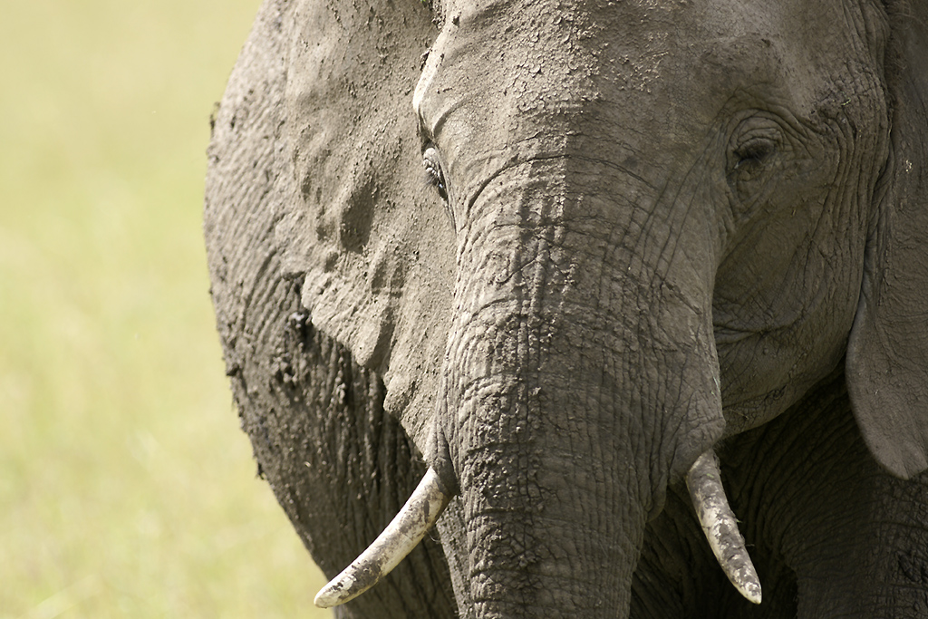
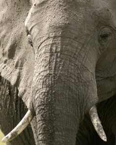
This is the photo of an elephant on the Musiara plains of the Masai Mara National Park in Kenya. Initially, I shot the horizontal photo below, in order to get a fairly good portrait of an elephant within a tight frame:
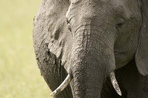
It is a fairly correct image: A touch of colour in the background, enough information in both highlights and shadows, good focus plane, nice structure on the skin of the elephant, both eyes are visible and both tusks are inside the frame.
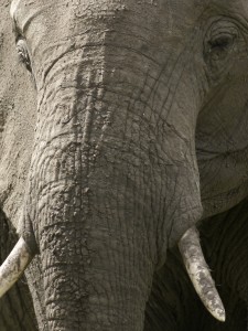
But after preparing/developping the trivial image (just minor levels correction, minimal unsharp mask), I thougt that it could be possible to try something else by re-framing the image:
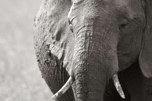
But while I was at it (and because of the nice work of light on the mud-covered skin of the animal), I also decided to try a black and white presentation (with desaturation by Photoshop and a little coloring of the image):
What do you think about it? Which one is the best image?
Leave a Reply